yellow. Corporate Identity
To capture the energy and atmosphere of a local professional, and transmit that into a corporate image was a tricky job. Especially because it had to invite young hipsters and portray a clean image of the salon industry. We had to brainstorm like crazy, and everyone knows about the fly by night salons, and tirelessly generic “Vo’s nails” so naming was a big part of this identity. To add to the already complex problem, the name had to be able to be scalable. At the moment the salon will be running within another salon, but hopes are to expand further and an image that is strong will be able to bring loyal supporters along for the ride wherever the location may be.
 |
 |
 |
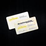
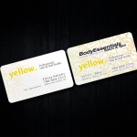
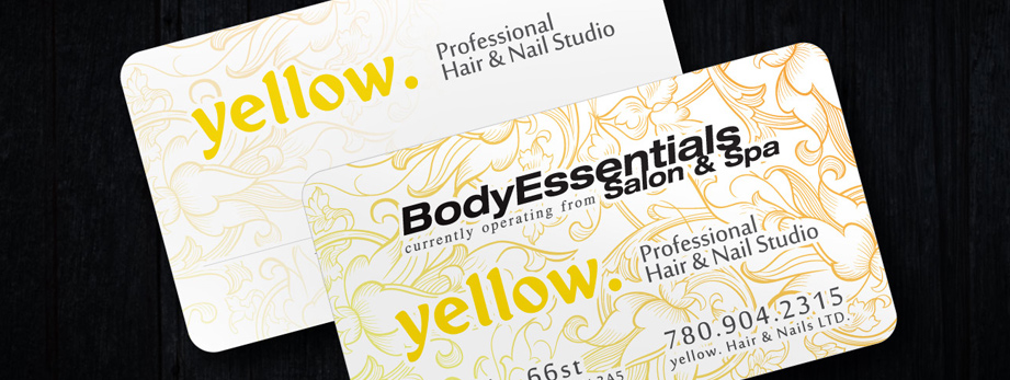
The name yellow. refers to the owners always bright and cheery attitude which in this industry goes a long way with clients. It’s also a simple and clean word that can be associated with many radiant and positive thoughts, well suited for a salon. The logo itself although extremely simple was very difficult to design as its simplicity often conflicted with any design attempts. Through the many variations and additions of scissors, colors, shapes and tag lines – distillation was the only answer, break it down to the simplest parts and let it do what it does best. In this case it was to be yellow. The font, one which hints at a bit of retro “norman” if I remember correctly, but a clean and simple arrangement cleans it up with a bit of a modern twist. To add a bit of flair & make her name stand out above the logo on top of hers I added a gloss effect to her logo which shimmers in the light.
At the moment the business cards had to have the locations logo above her own, but eventually simplicity of yellow will be echoed throughout her cards as well.
Thanks for looking,
Chris.
